daXai
Logo Design
About
daXai is a simple and effective digital marketing "mentor" created by Mercer-MacKay Solutions. They offer templates, wizards, and guidance for tech companies to create better marketing content.
Responsibilities: I led the development of the final logo design after the team concept phase, focusing on creating a mark that was both distinctive and aligned with the brand’s overall identity. Once the logo was finalized, I designed a custom animation to bring it to life—adding motion that reinforced the brand’s lively tone and elevated its digital presence.

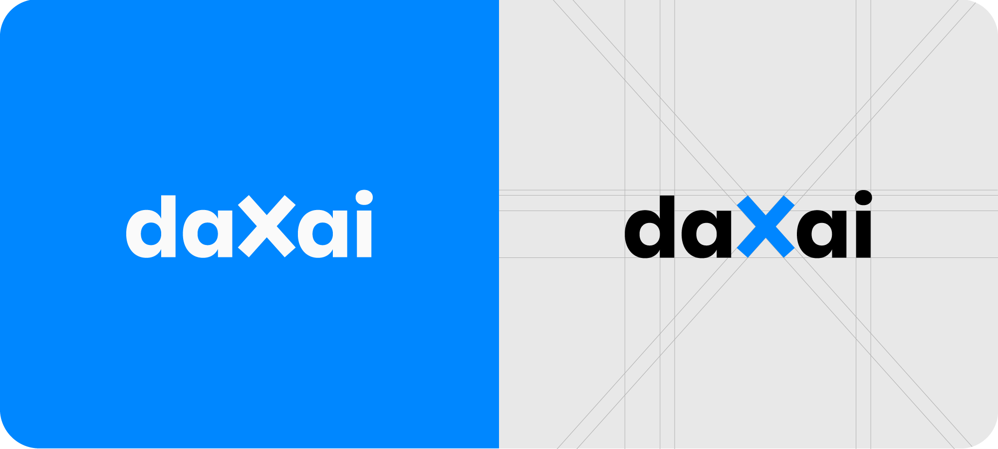
Logo
The daXai logo encapsulates the company's mission to bridge data, innovation, and artificial intelligence. The bold X introduces a dynamic contrast, symbolizing the unique value proposition—the X Factor—that daXai offers through storytelling and thought leadership. Its minimalist approach ensures timeless versatility across various media, making it a strong visual cornerstone for the brand's identity.
Colour
The vibrant blue was chosen to convey a mood of confidence, clarity, and innovation. Its energetic tone sets the company apart from more traditional, corporate palettes, while still evoking the trust and professionalism associated with the colour blue. This modern, saturated hue reflects the brand’s forward-thinking approach and positions it as both tech-savvy and creatively driven. In a competitive landscape, it signals a bold yet approachable presence grounded in clarity and strategic insight.
Typography
Poppins was chosen for its rounded letterforms, which lend the brand an approachable and casual feel—perfectly complementing daXai’s witty, friendly, and educational tone of voice. Its clean, modern style aligns with the visual language of tech-focused brands, reinforcing daXai’s identity as a forward-thinking and trustworthy partner in the technology marketing space.