Chá House Mooncake
Logo, Packaging, Social Media
About
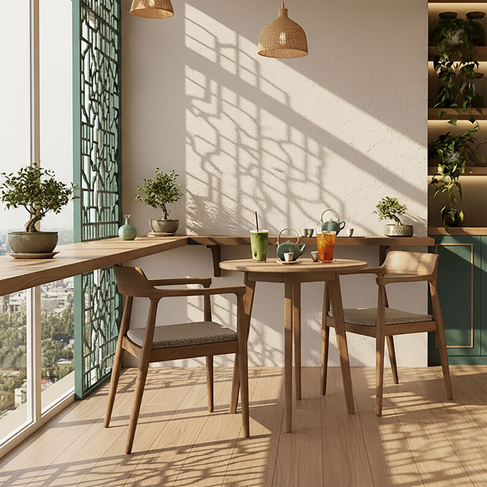
Chá House is an Asian-owned café that blends heritage and innovation. The café features an Asian-inspired interior with natural wood tones, lantern lighting, ceramics, and greenery that evoke the calm of a traditional teahouse reimagined for a modern city. Each visit feels like a pause from the world outside. A space to slow down, sip, and reconnect.
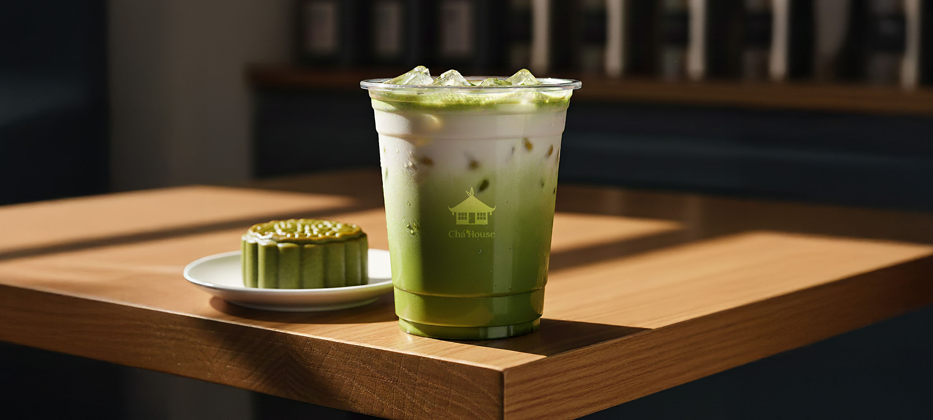
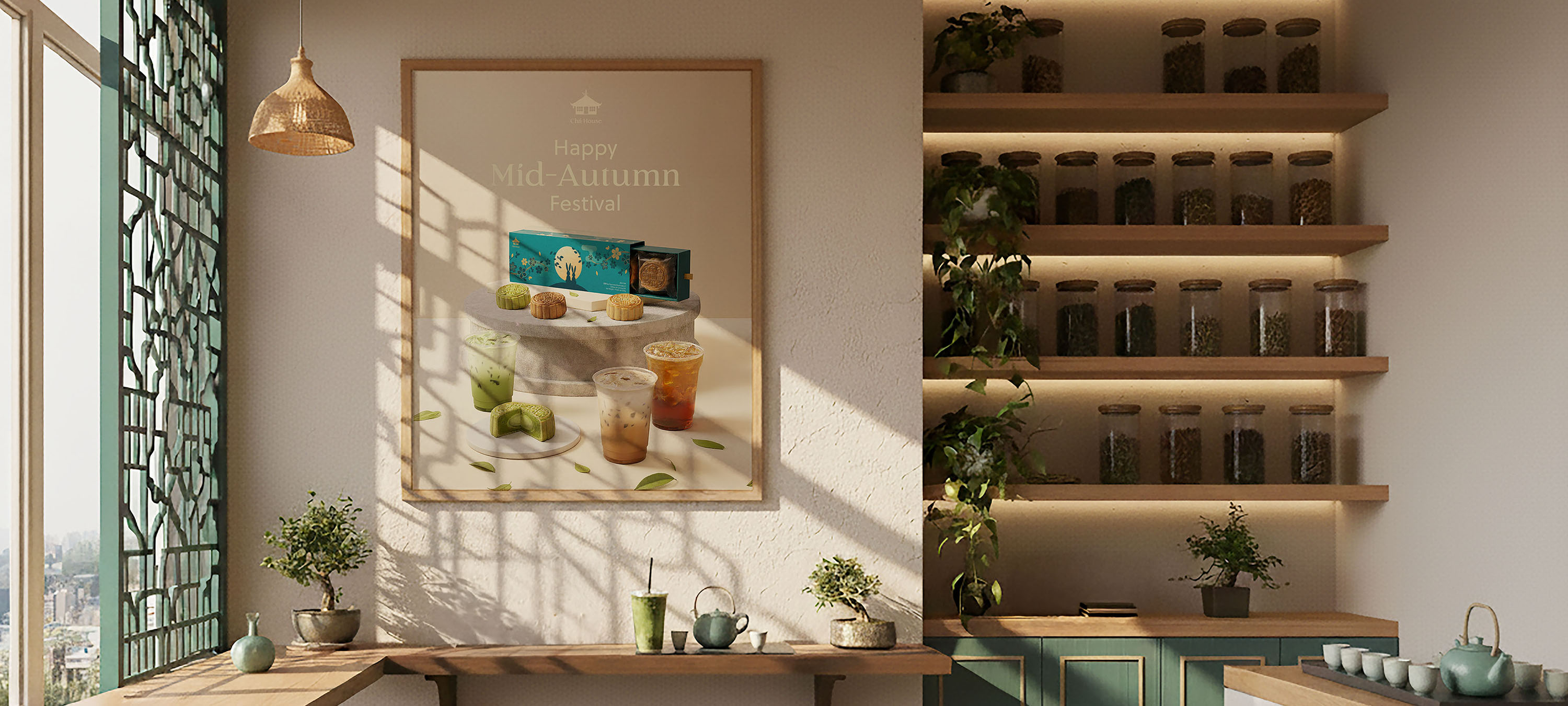
Each season, Chá House celebrates cultural moments like Mid-Autumn. Seasonal treats like handcrafted mooncakes and tea pairings bring ancient traditions to life for modern guests, fostering a sense of connection across generations.
Role: Creative direction and design
Responsibilities: For this conceptual design project I defined the cafe's brand story, packaging, colour palette, logo, and animated visual storytelling of Chá House's mooncake packaging to bring it to life.
At Chá House, tea isn’t just a drink. It’s a bridge between past and present, tradition and trend.
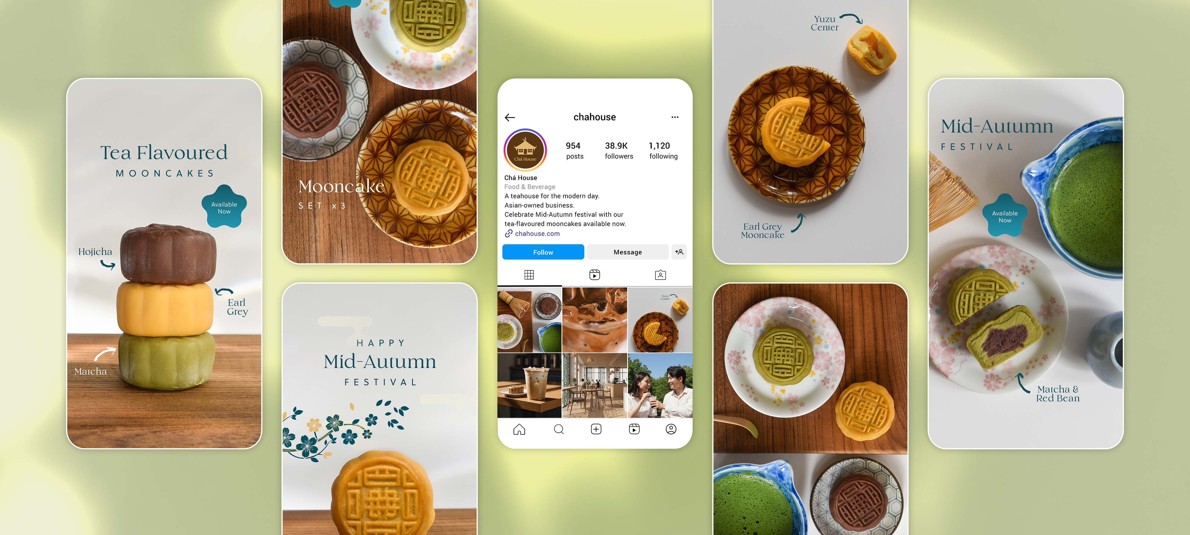
Visual Storytelling
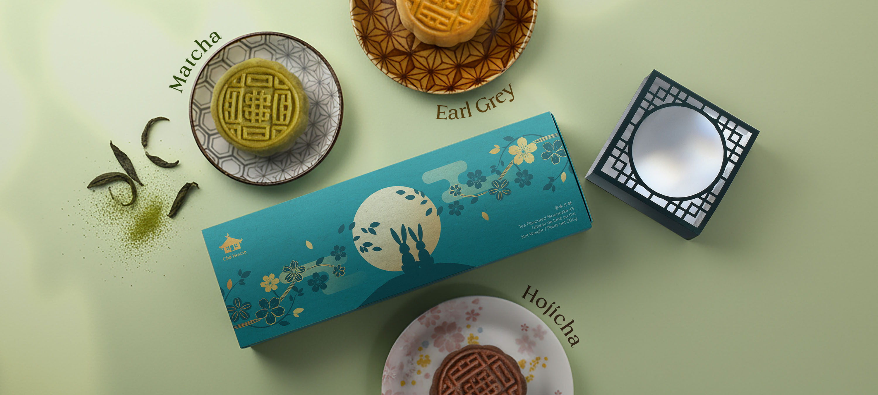
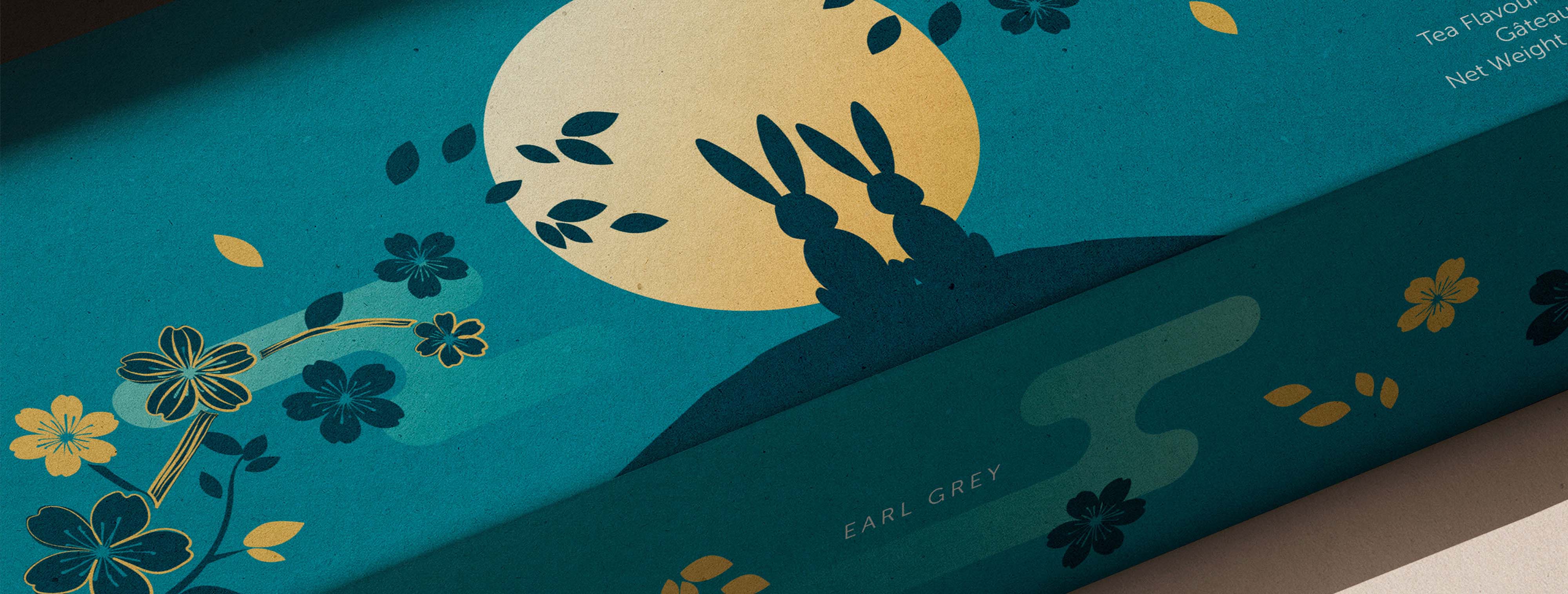
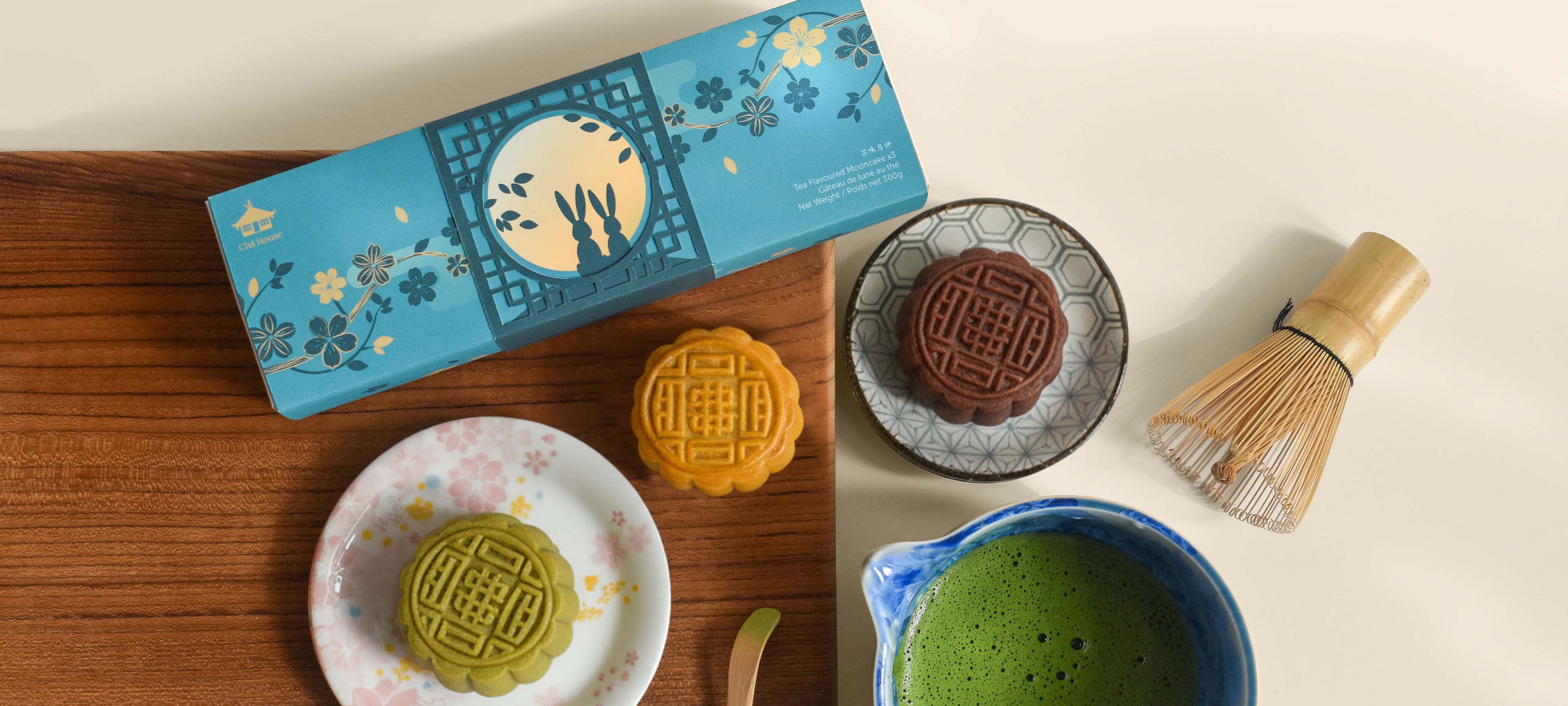
Chá House's tea-flavoured mooncake box set includes three beloved flavours: matcha, earl grey, and hojicha reimiagined with delicious flavoured fillings like yuzu and red bean. The design captures a quiet Mid-Autumn moment: two rabbits gazing at the full moon through a moon gate, a traditional element found in Chinese gardens. Around them, flowers bloom and petals drift softly in the breeze. When the laser-cut lattice sleeve is aligned with the box, the scene comes to life. The rabbits appear to look through the moon gate at the glowing full moon, symbolizing reunion and unity.
The package uses teal as it's primary colour to convey harmony and balance with a youthful edge. Meanwhile, yellow evokes feelings of joy and happiness that surrounds families during the season and draws on the full Autumn moon's golden and sometimes orange colour.
Logo
The Chá House logo draws inspiration from the architecture of a traditional Chinese teahouse, its roof playfully adorned with tea leaves. The design pairs this emblem with an elegant serif wordmark, whose refined strokes and delicate contrasts echo the rhythm of Chinese calligraphy. Together, the two elements find balance: the flowing curves of the roofline mirror the soft forms of the letters A and U, creating a sense of harmony.