Astro Magazine
Editorial Design
InDesign, Photoshop
Background
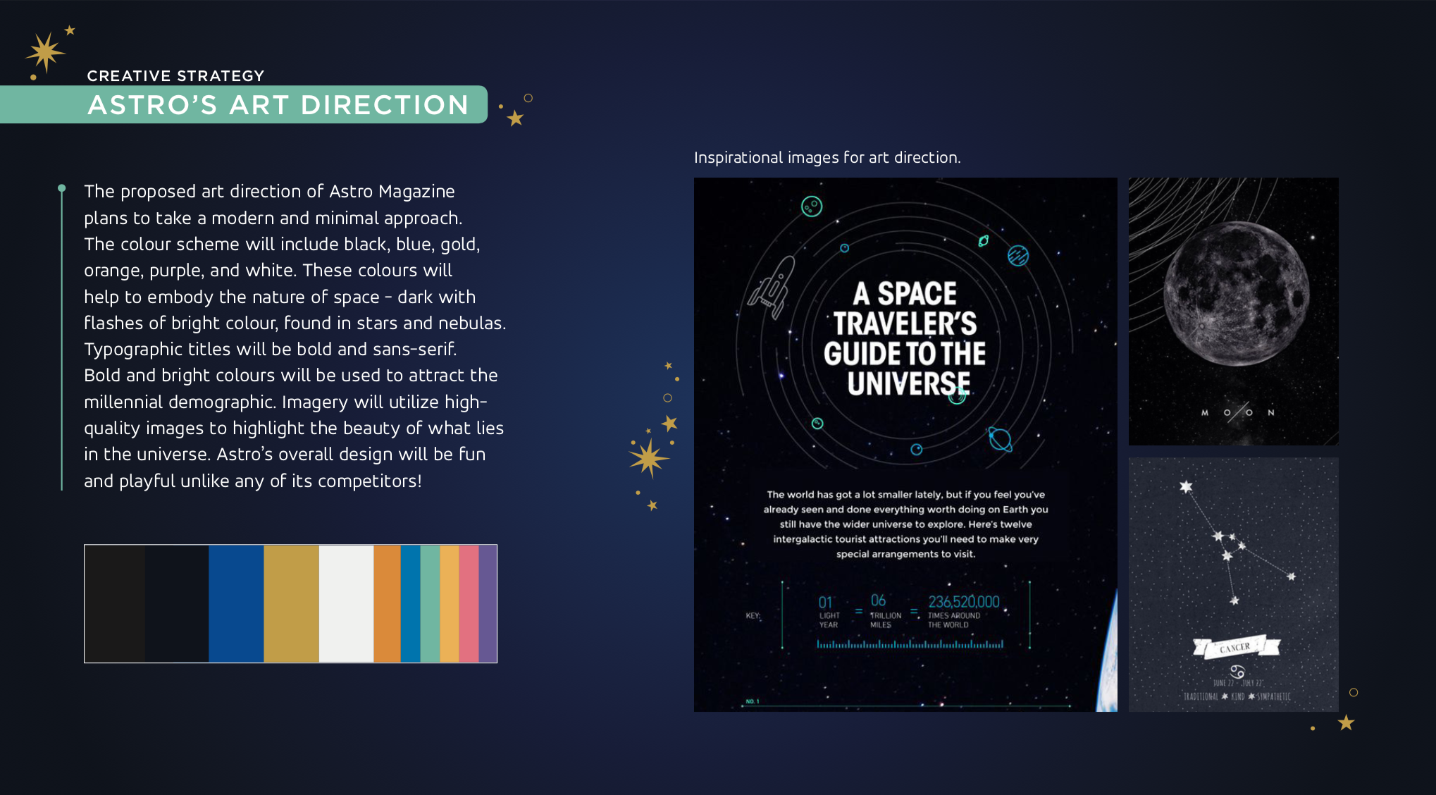
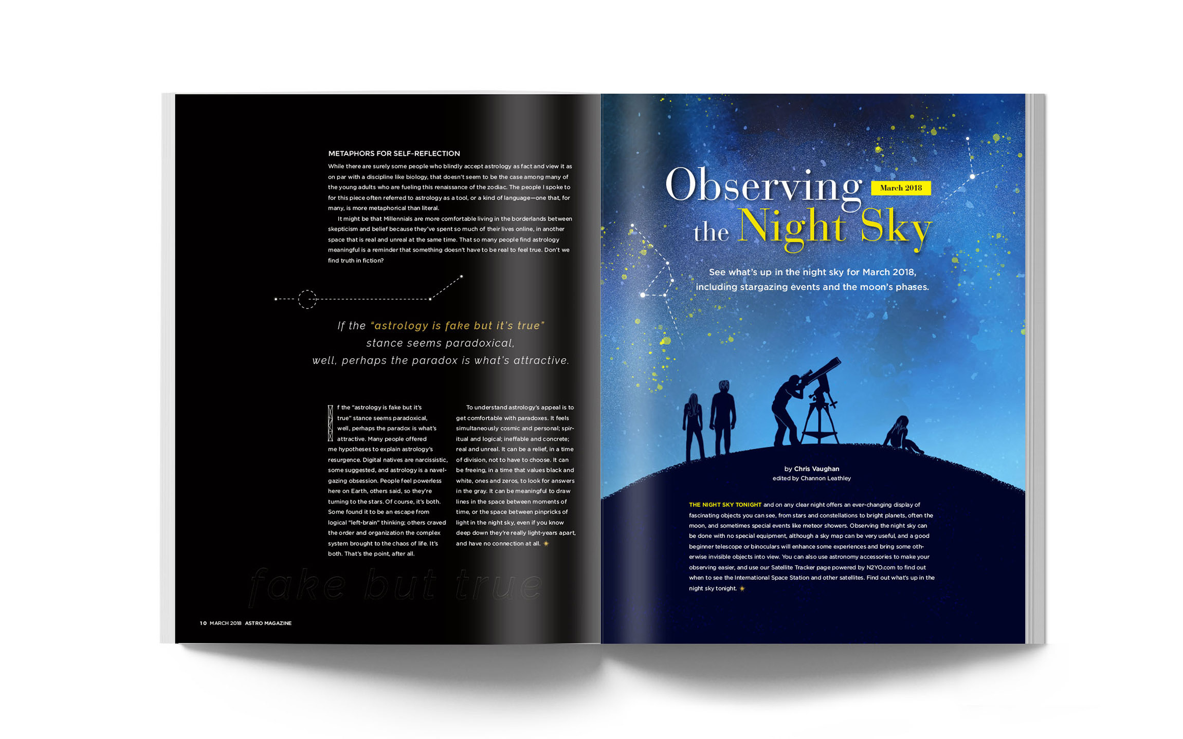
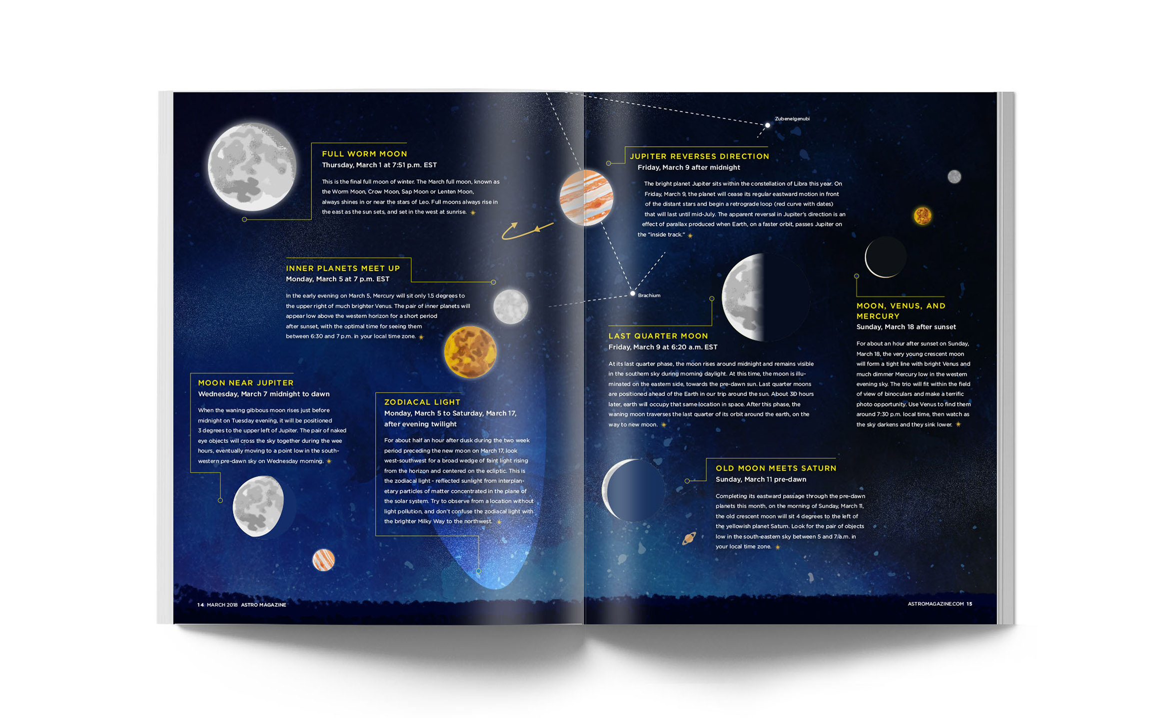
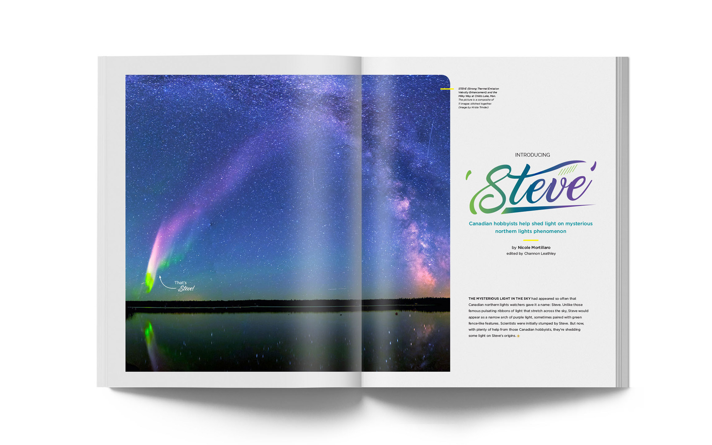
Astro Magazine is an astronomy and astrology magazine for casual space enthusiasts targeted towards ages 18 to 30. The design direction takes on a minimalistic approach with beautiful imagery and typography to accompany opinion articles, stargazing moments, and new discoveries.
The challenge was to design a 24-page original magazine that included real ads, a high key and lowkey cover, a typographic based feature, an illustrative based feature, and a photographic based feature. In addition, we had to design a scrolling ePub version of the magazine.
Process
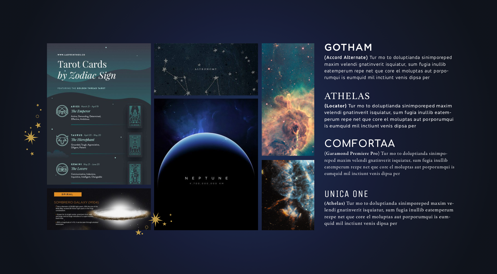
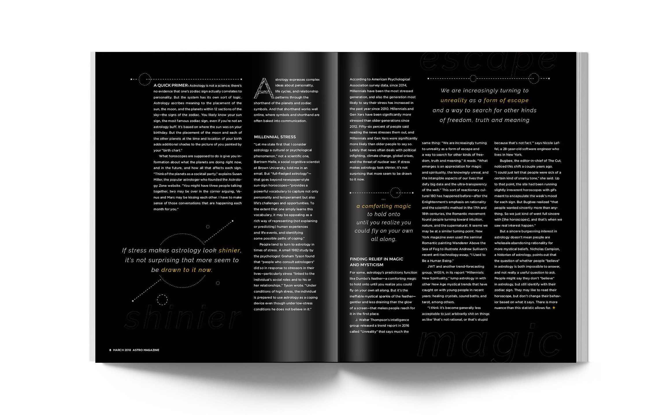
I chose a space magazine to design beceause it's a subject I've been really interested in over the past several years. I started this project by defining a target market, researching competitors, finding what makes my magazine unique and deciding on an art direction. I tested out several ideas for each feature and kept refining the spreads, adding little details or moving elements around.
Masthead
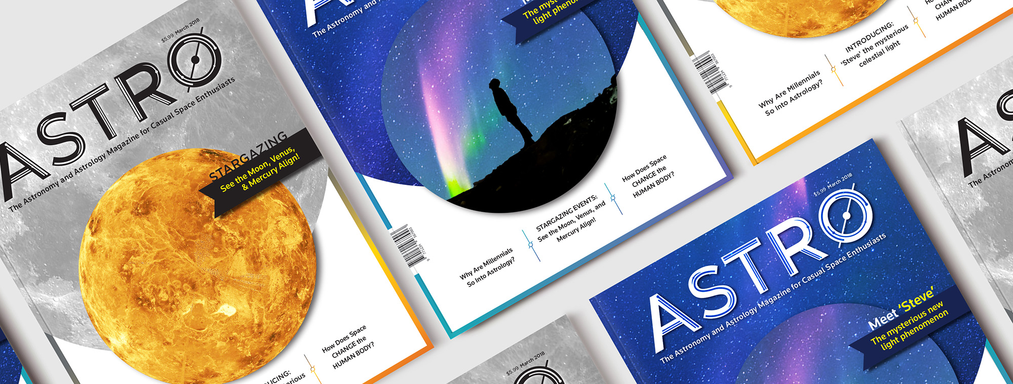
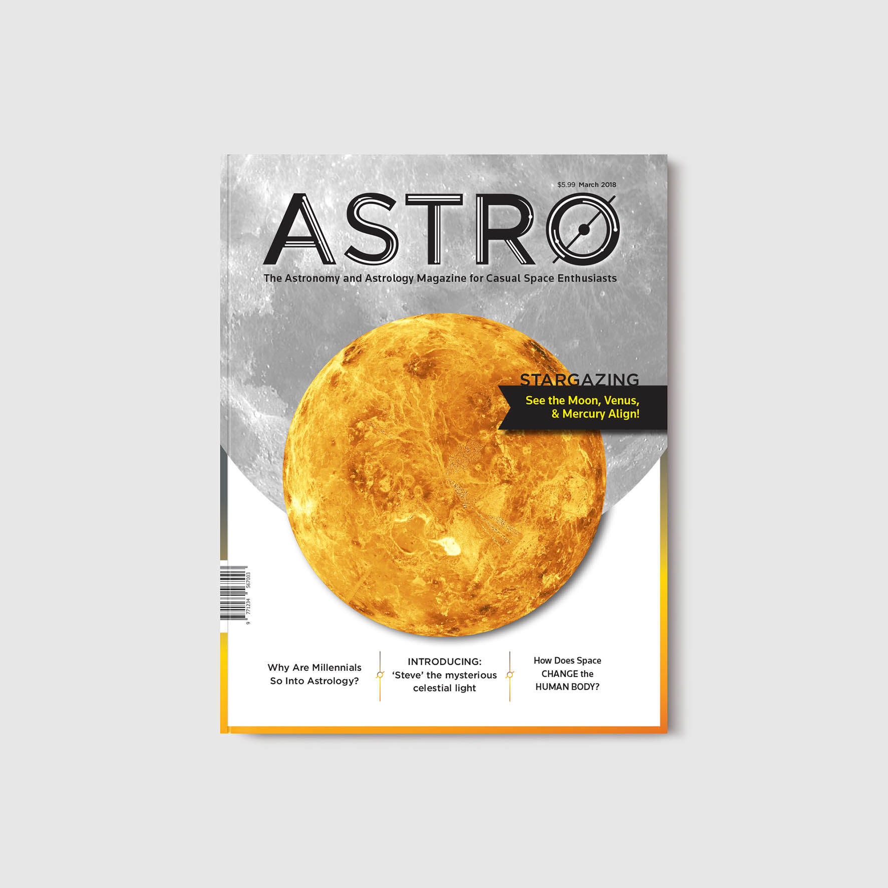
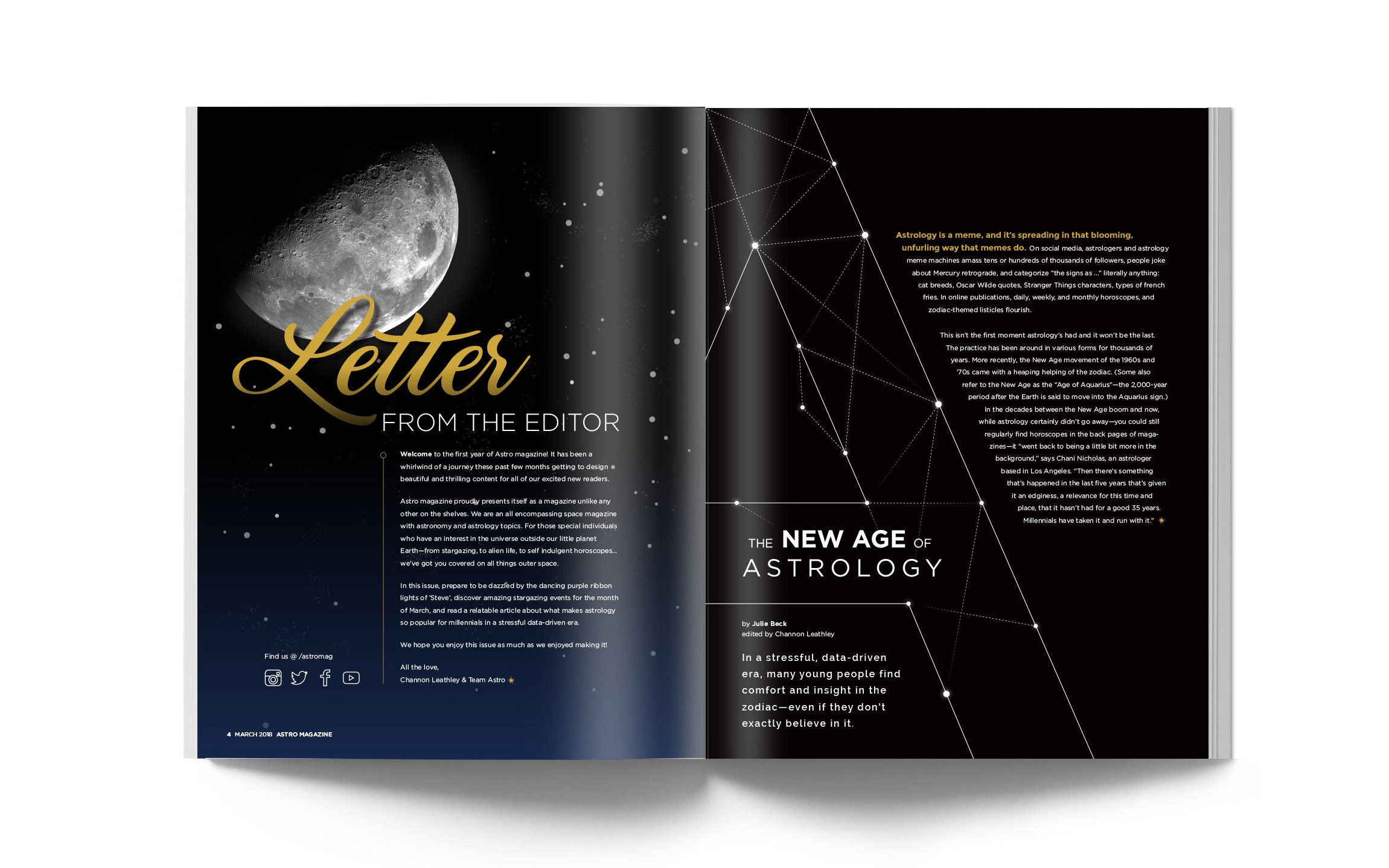
Astro's low key and high key mastheads are inverted versions of each other. The planetary detailing colour on the white masthead can be subject to change according to the cover image. I modified the typeface Gotham to make the masthead unique to my magazine and give it a cosmic personality.


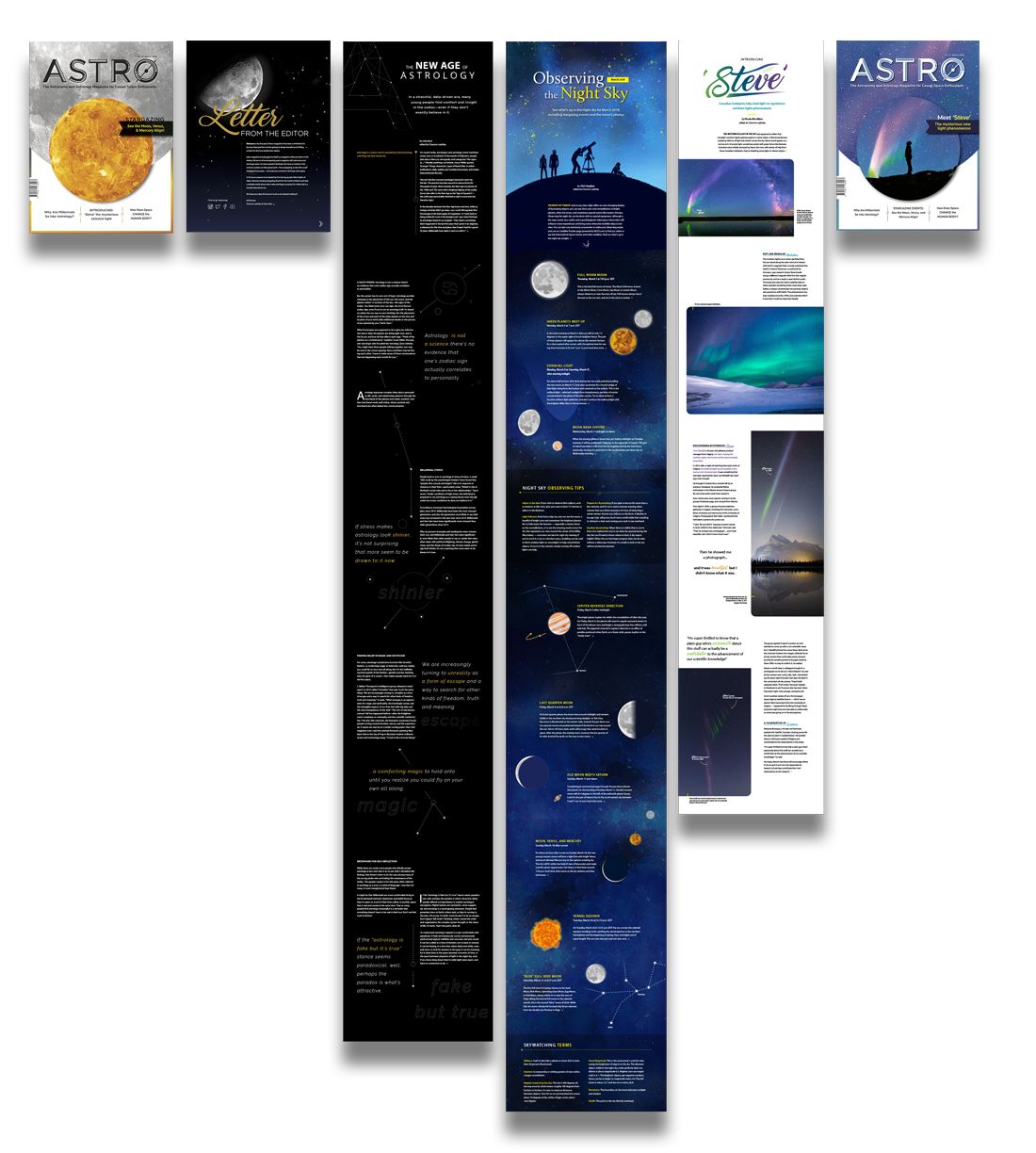
Scrolling ePub