Mercer-MacKay
Branding, Website
Illustrator, InDesign, Photoshop, Adobe XD
Objective
Mercer-MacKay Digital Storytelling is a B2B marketing agency for tech companies. They lead with thought leadership and storytelling to help brands build a connection with their audience.
As part of their rebrand, a sleek logo and visual identity that exemplified sophistication, professionalism, and creativity was needed.
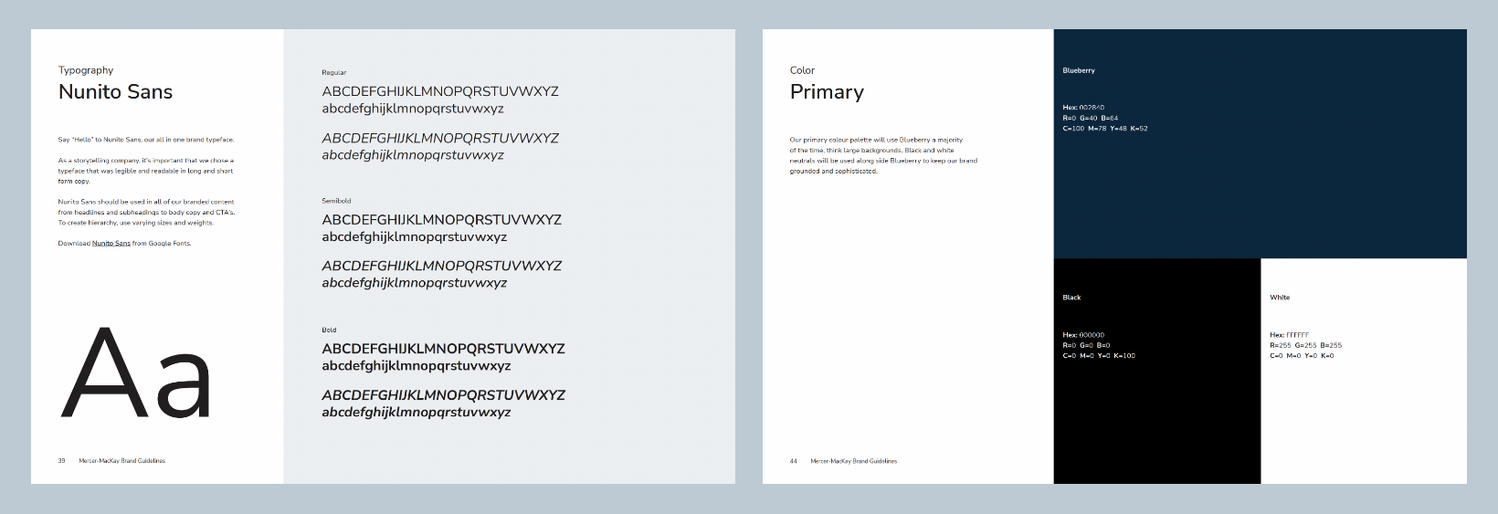
Mercer-MacKay requested a monochrome colour palette for the next phase of their brand.
Design: Channon Leathley, MMS
Creative direction: Sarah Stoyanovich, MMS
Content and development: Mercer-MacKay, It’s Nerd Inc.
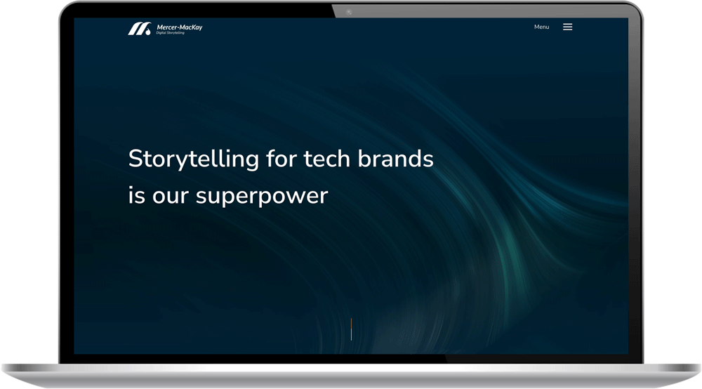

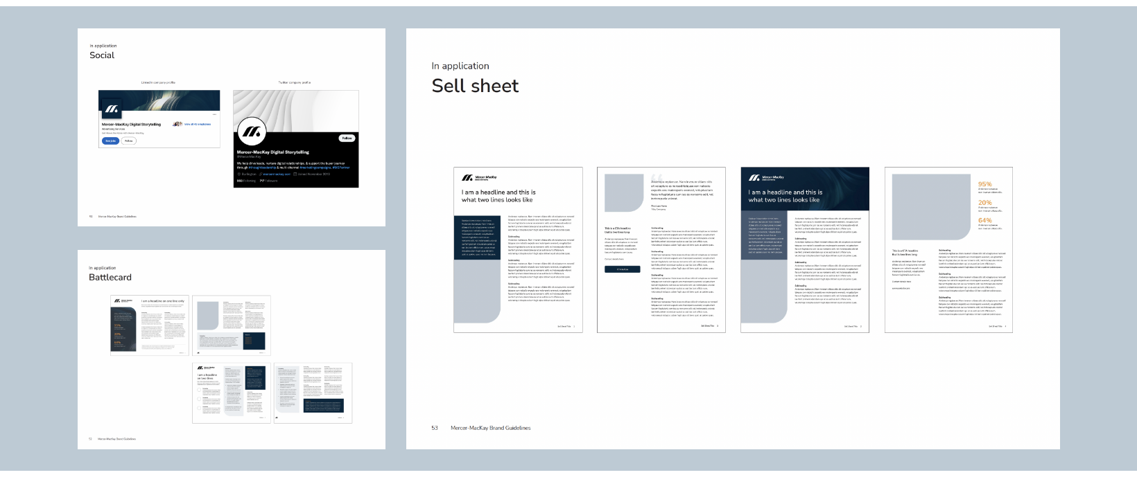
Sleek & Sophisticated
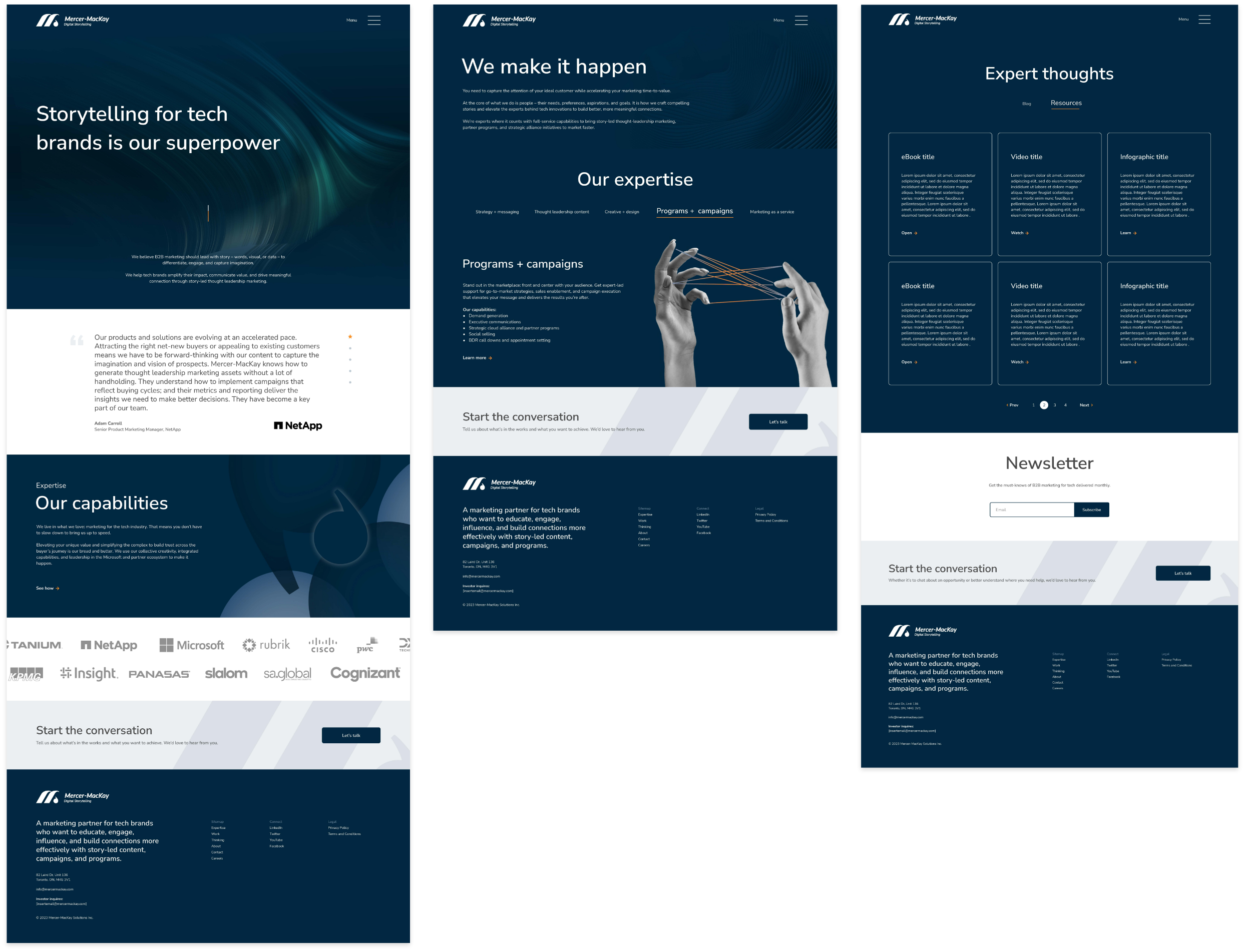
The new brand opts for monochromatic blue-grey tones with orange accents. Darker blues represent reliability and strength, while orange reflects optimism and friendliness.
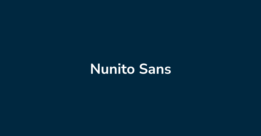
To elevate the typography, we established strong hierarchy and introduced a new brand typeface. As a storytelling company, it’s important we chose a typeface that was legible and readable in long and short form copy. Nunito Sans is a Google Font that does just that. We opened up the leading to create more white space and enhance the visual appeal for a sophisticated look.
Logo
To represent the storytelling aspect of Mercer-MacKay, the icon is a dynamic letter M with a nod to writing and punctuation. The word mark uses Knowledge as the base font. Specific letterforms we’re carefully rounded out (like the M and K) for a softer, approachable feel that compliments the icon. The Golden Ratio and Fibonacci Sequence helped to achieve perfect rounded arches and ratios between the punctuation mark and main component of the M. Variations of the logo allow the brand to be versatile in many environments.
Keywords
Modern, Approachable, Movement